2018 has been a strong a year in fintech and has seen a record level of investments. Most fintechs target their offerings to the millennials generation(people under 30): the first digital generation in our history. Apart from being tech-savvy and open to new technology, there is another reason why they are the centre of attention. By 2030, millennials would hold $20 trillion in wealth: more than anybody else in human history. Mobile has proved to be one of the strongest channels to reach them. According to statistics Millennials spent several hours per day on their phone in 2017. This is partly the reason why there has been an unprecedented rise in released financial apps. So much competition, coupled with the fact that millennials attention span is shorter than the one of a goldfish (according to Microsoft research) makes it really hard to stand out. We would examine several ways you could go ahead of the competition with your mobile app in this crowded space.

Gamification
The millennials grew up spending hundreds of hours on PlayStation and Nintendo. That inevitably influenced how they interact with new stuff.
Gamification is the use of game design techniques and mechanics in a non-game context to solve problems. In the context of fintech apps, gamification could increase user engagement. You could add simple things like prompting users to set goals (e.g saving X amount) and reward them upon achievement. If they receive meaningful rewards for their engagement, it could
Onboarding
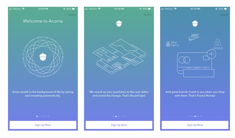
Onboarding is an underestimated part of the app experience. It is literally the first impression that your users have with your product and as the old saying goes first impressions matter. Fintech apps due to their nature, have usually lengthier onboarding process than apps in other categories. There is plenty of data that needs to be collected and that is a double-edged sword. On the one hand, too lengthy onboarding may turn off millennials from using your app, on the other hand too short one would rob you from the chance to collect data, engage them and explain the basic terminology or functionality. A good example is Acorns: a spare change investing app. Not only it is stunning visually and easy to follow, but it does a good job of explaining what is the app really about in the first 30 seconds. Good practices that you could take home from them: use story-telling to emphasize the value of your product, ask only for the necessary information and prompt

Clean UX/UI
The best fintech apps are the ones that are easy to understand at one glance. You could use different graphs, charts to transform complex financial data to be easily readable on a mobile screen
Another important aspect
Focus on the Ecosystem and brands
Lastly, focus on building an ecosystem around your app and product that would add value and make it useful.
How many savings, payments or banking apps the world and millennials really need? The answer is probably less than there currently are. “We don’t need another fintech app frankly,” said Satya Patel, a partner at Homebrew Ventures at the Future of Fintech conference in NY back in 2017. Millennials value practicality and convenience above all, so focus on building something that would be useful in different ways.Build a real challenger product rather than another shiny mobile app.
A good example is Starling bank and its in-app marketplace that integrates with dozens of other services. On top of its main functionality, there is another whole layer that allows users to look after their travel insurance, pensions etc. That really sets the Starling bank apart from other challenger banks.
Fintech, millennials and mobile is a match made in heaven. However, it is a crowded marketplace. You would have to carefully study your audience and opportunities before releasing an app.
If you’re looking for an experienced app development partner, then Donatix is right for you.


